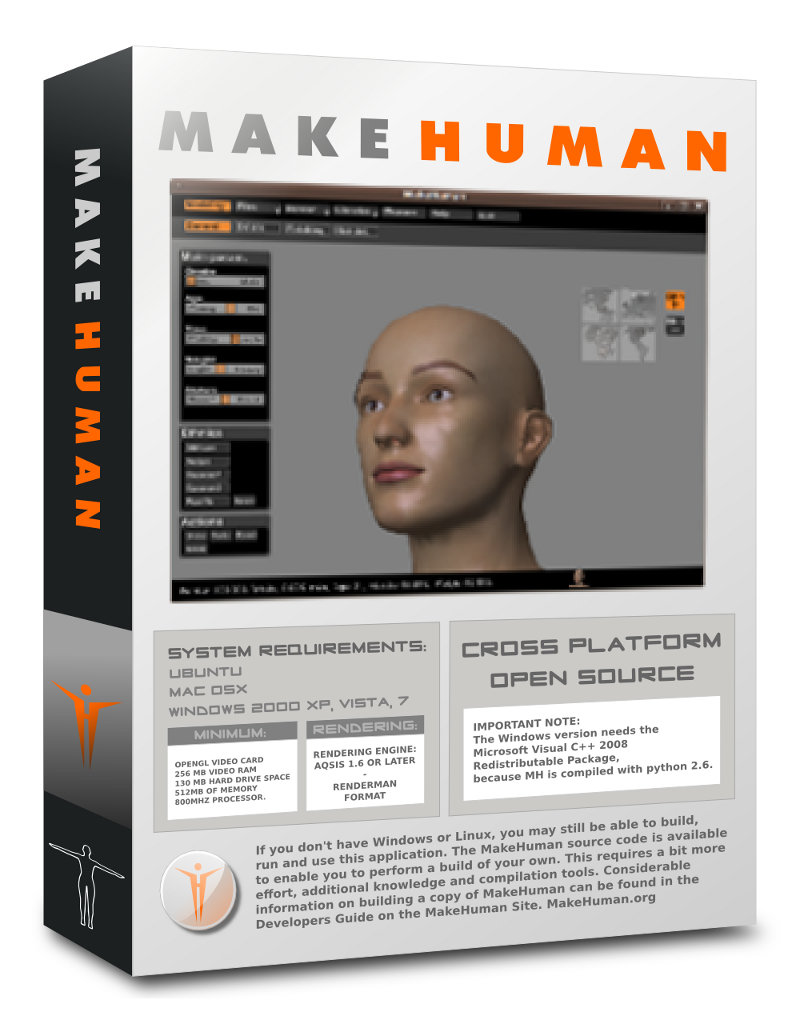
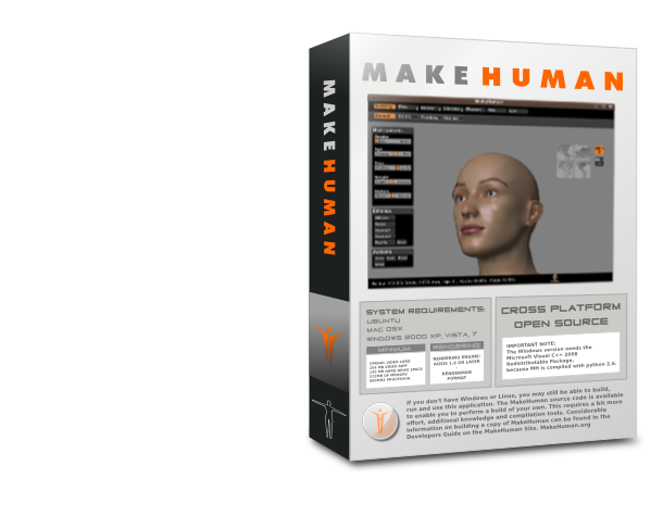
What I like:
The box rocks and gives the media and end user a lot of information in a solid condensed way but not in an overwhelming way.
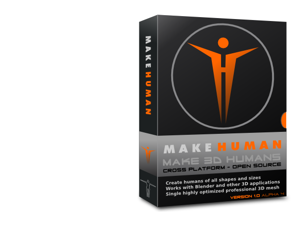
Hand drawn artist style box (from scratch) rather than a funky software generated boxes.
Icons, logos and details.
SVG sharp details.
What I do not like:
The screen captures should have the final version and not the nightly build.
I still like the centred logo with the "H" better than without the "H" but that is a minor detail.
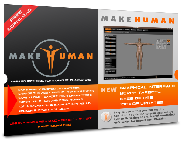
"Add a background image sculpting aid" Could be said much better
Comments welcome...
PS: Creating a box this nice I should be entitled to a free copy of the software