MakeHuman Logo Art

This forum is aimed at user contributions, in the form of assets, side projects, code patches and similar.

Moderator: joepal

MakeHuman Logo Art

Postby VitalBodies » Tue Jan 12, 2010 7:45 am

Today while trying to get AQSIS to work with MakeHuman I made this artwork...
Just for fun. My own take on this fun and exciting open source offering.

Image

What I like about this version of the artwork:
More of a hand written "human" font.
Outline of the human is from the current version of MakeHuman.
The two figures create a nice dynamic.

What I do not like about this version:
Needs more work to display well really small.
Image
Ubuntu 10.04 (Lucid) 64-bit
http://www.vitalbodies.net/site/art-des ... anorg.html
MakeHuman 1.0Alpha4 - Blender - Inkscape - Gimp - AQSIS 1.6
VitalBodies
 
Posts: 91
Joined: Tue Jan 05, 2010 8:00 pm

Re: MakeHuman Logo Art

Postby Manuel » Thu Jan 14, 2010 3:04 pm

Nice font...
When I've time I'd like to publish an history of MHlogo. It seem the human in the logo has stimulated a lot of creative ideas during these years :-)

Best,

Manuel
Manuel
 

Re: MakeHuman Logo Art

Postby VitalBodies » Thu Jan 14, 2010 8:12 pm

That would be fun to see. : )
Image
And doing art is fun!
Nice to have the software to make it happen...
Last edited by VitalBodies on Thu Jan 14, 2010 11:01 pm, edited 1 time in total.
Image
Ubuntu 10.04 (Lucid) 64-bit
http://www.vitalbodies.net/site/art-des ... anorg.html
MakeHuman 1.0Alpha4 - Blender - Inkscape - Gimp - AQSIS 1.6
VitalBodies
 
Posts: 91
Joined: Tue Jan 05, 2010 8:00 pm

Re: MakeHuman Logo Art

Postby VitalBodies » Thu Jan 14, 2010 9:08 pm

More Art for fun...
Image
Image
Ubuntu 10.04 (Lucid) 64-bit
http://www.vitalbodies.net/site/art-des ... anorg.html
MakeHuman 1.0Alpha4 - Blender - Inkscape - Gimp - AQSIS 1.6
VitalBodies
 
Posts: 91
Joined: Tue Jan 05, 2010 8:00 pm

Re: MakeHuman Logo Art

Postby jcapco » Tue Jan 26, 2010 5:42 pm

Hi VitalBodies.. hope you don't mind me using the button for download icons of makehuman in the blog :) .. I liked this last one :)

I liked most of the artwork here.. The current makehuman splashscreen reminds me of Poser Pro, box:

Image

Hope Poser don't sue us :P Though I don't think they are very very similar, I actually like our splashscreen.
Last edited by jcapco on Tue Jan 26, 2010 5:50 pm, edited 2 times in total.
jcapco
 
Posts: 157
Joined: Wed Jan 13, 2010 6:26 pm

Re: MakeHuman Logo Art

Postby VitalBodies » Tue Jan 26, 2010 5:49 pm

jcapco wrote:Hi VitalBodies.. hope you don't mind me using the button for download icons of makehuman in the blog :) .. I liked this last one :)

How fun!
Let me know if there is a custom size you want, some other change or a different graphic altogether for the blog or other location.
Image
Ubuntu 10.04 (Lucid) 64-bit
http://www.vitalbodies.net/site/art-des ... anorg.html
MakeHuman 1.0Alpha4 - Blender - Inkscape - Gimp - AQSIS 1.6
VitalBodies
 
Posts: 91
Joined: Tue Jan 05, 2010 8:00 pm

Re: MakeHuman Logo Art

Postby Manuel » Wed Jan 27, 2010 8:10 am

VitalBodies wrote:
jcapco wrote:Hi VitalBodies.. hope you don't mind me using the button for download icons of makehuman in the blog :) .. I liked this last one :)

How fun!
Let me know if there is a custom size you want, some other change or a different graphic altogether for the blog or other location.


I've used the download icon here:

https://sites.google.com/site/makehumandocs/

Unfortunately, it will be needed to change the font, in order to match the official one...but it's so nice that I've used it anyway :-)

@Jose: well..our splash screen has a "progress" idea: the man is going gradually to stand up...in 1.0 stable it should be completely up :-P
Manuel
 

Re: MakeHuman Logo Art

Postby VitalBodies » Wed Jan 27, 2010 6:03 pm

Where can I get the official MakeHuman font?
I think the readability of the font is very nice and works well small or large on logos.

Is there a size the splash screen should be?

I have been making logos and download buttons more or less a random size and for a white background.
I make these in Inkscape so I can resize them if/as needed.
There are size considerations:
The invisible background which is the overall size.
Should there be a drop shadow or not or does the button go edge to edge with other buttons.
The size of the logo or button itself.
I would need to know the overall size if you have a special place you want a logo or button that is a fixed size - I would need to know if you want a drop shadow and/or space around the button/logo or edge to edge.

Note that the light comes from the top left so the shadow in on the bottom right. If the site(s) or software uses light from the top right (or other location) that should also be indicated.
Last edited by VitalBodies on Wed Jan 27, 2010 7:43 pm, edited 2 times in total.
Image
Ubuntu 10.04 (Lucid) 64-bit
http://www.vitalbodies.net/site/art-des ... anorg.html
MakeHuman 1.0Alpha4 - Blender - Inkscape - Gimp - AQSIS 1.6
VitalBodies
 
Posts: 91
Joined: Tue Jan 05, 2010 8:00 pm

Re: MakeHuman Logo Art

Postby VitalBodies » Wed Jan 27, 2010 7:34 pm

Image


This should IMO look better than the old version (but use what you like).
There are enhanced shadows and other subtle changes for the MakeHuman site(s) medium 60% grey background.
Last edited by VitalBodies on Thu Jan 28, 2010 6:07 am, edited 1 time in total.
Image
Ubuntu 10.04 (Lucid) 64-bit
http://www.vitalbodies.net/site/art-des ... anorg.html
MakeHuman 1.0Alpha4 - Blender - Inkscape - Gimp - AQSIS 1.6
VitalBodies
 
Posts: 91
Joined: Tue Jan 05, 2010 8:00 pm

Re: MakeHuman Logo Art

Postby VitalBodies » Thu Jan 28, 2010 3:51 am

Just think of the fun one could have with the official font!
: )

Image

Approximate look on the MakeHuman site(s) 60% grey background.

Image

What would one want the box to say?

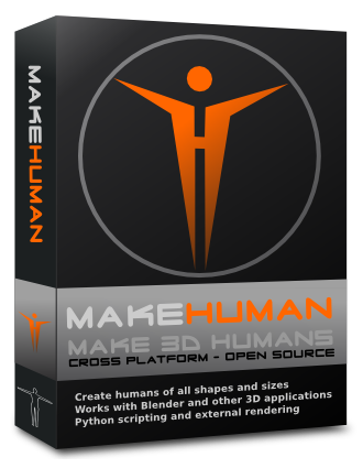
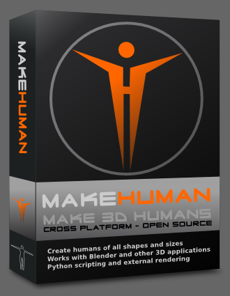
What I like:
I like how this turned out - it rocks - I liked the overall impression that is made - PRO software.
I liked the 3d quality of the box and the subtle lighting effects that I added.
If nothing else this would make some nice eye candy on the MakeHuman blog.
What I did not like:
Not sure what the wording should be so I made a rough draft attempt.

Update:
If I did this again I would change the wording at the bottom slightly and add the version number to see if there is an improvement.
I would make the edge/corner of the box lighter to compare to the darker edge.
Not sure about the version number or not.

Image
Image
Ubuntu 10.04 (Lucid) 64-bit
http://www.vitalbodies.net/site/art-des ... anorg.html
MakeHuman 1.0Alpha4 - Blender - Inkscape - Gimp - AQSIS 1.6
VitalBodies
 
Posts: 91
Joined: Tue Jan 05, 2010 8:00 pm

Next

Return to User contributions

Who is online

Users browsing this forum: No registered users and 1 guest